


Charity, Education, Technical
Designing a digital experience using iteration and prototypes
Ed Wilkinson, Digital Services Director at IE Digital, discusses the use of prototyping as part of the digital design progress. As an example, we used this method to compress two information-packed A2 printed posters into a usable digital solution for mobiles, tablets and desktops for the financial education charity pfeg.
From concept to completion
A new digital service or product might begin with a thought in the shower, scribbles on a notepad or a conversation across a table – and there are lots of ways to get from concept to completion.
Of course the approach depends on what’s being built, but – more often than not in the digital space – a good place to start is iteration. IE Digital have long been advocates of delivery through iteration – starting with a minimum viable product (MVP) that is iterated over time, honing an optimal solution through waves of feedback and refinement.
Prototyping is different. Rather than being developed into the finished product, a prototype is discarded. It’s part of the design journey, just like a wireframe or a flow diagram, rather than part of the final output. For this reason, some people associate prototyping with high-budget projects and wastefulness. Several years ago these were very valid concerns, but these days UX consultants and designers have a wealth of tools for creating rich, accessible prototypes within shorter timescales and tighter budgets.
So with cost out of the picture – why not prototype?
At IE Digital, we believe that it’s better to invest time in prototyping an experience, rather than challenging stakeholders to imagine it through a series of static diagrams, wireframes, documents and designs. A prototype is, in many cases, significantly more useful than a specification document, a set of wireframes and a visual design. Because it can roll all of these aspects together – technical details, layout, structure, and look and feel – to define an experience that can be tested and validated.
As an example, we took pfeg through this process several years ago, when we digitised their primary and secondary planning frameworks.
The background
pfeg (the Personal Finance Education Group) is the UK’s leading financial education charity, based in London. pfeg has two planning frameworks: ages 3 to 11 and 11 to 19. These frameworks support the planning, teaching, and progression of financial education. They are designed in a way that helps teachers to deliver financial education flexibly across the range of different subjects and learning opportunities available within school curricula.
IE Brand had designed two printed A2 posters, handed out as part of a resource pack for My Money Week, which detail the planning frameworks.
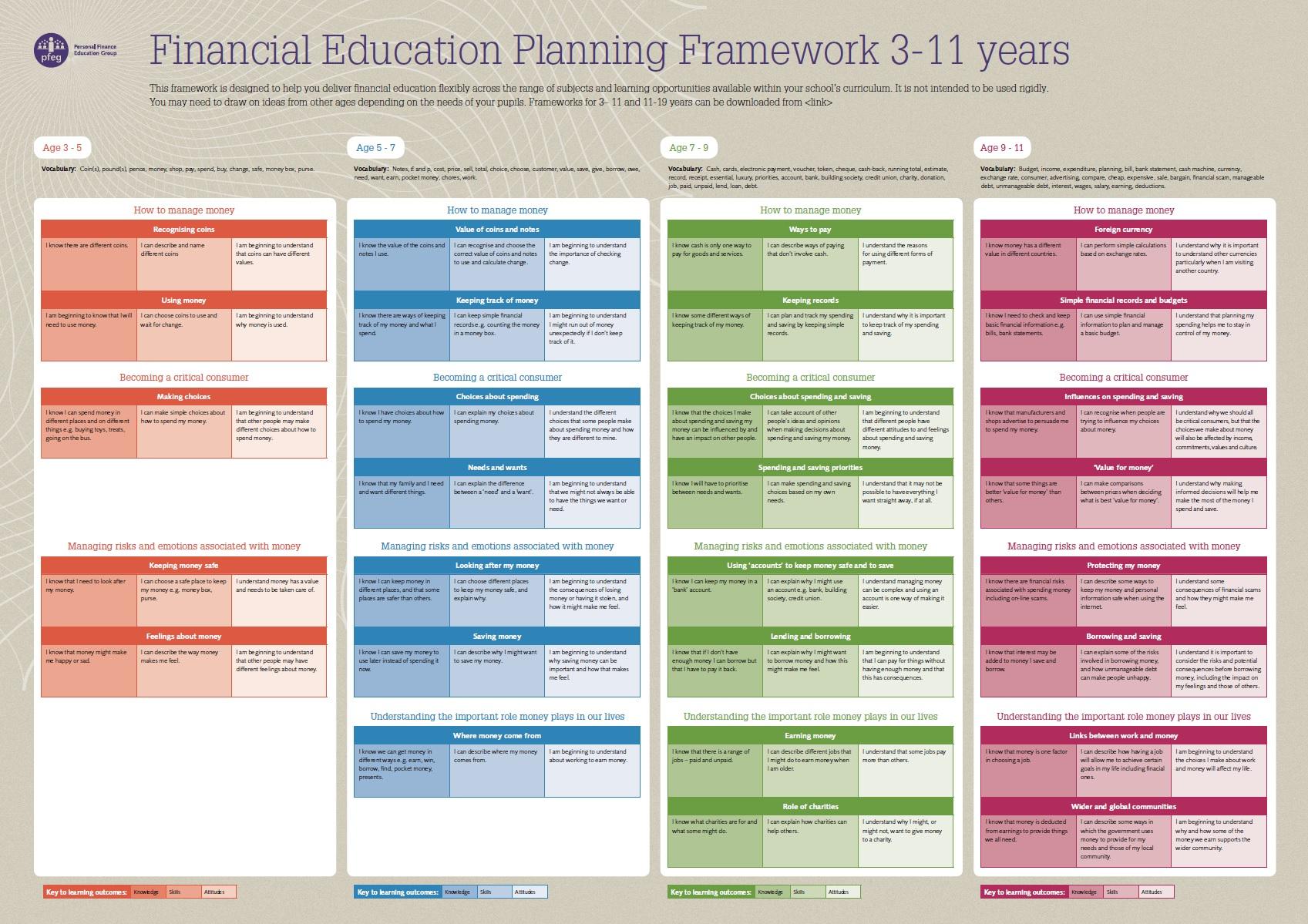
Starting point: One of two planning frameworks in A2 poster form
The challenge
pfeg wanted to condense these two, A2 sized, information-rich planning framework posters into a digital user experience. Specifically they wanted:
- Both planning frameworks to be accessible as a single digital solution on the pfeg.org charity website.
- Users to be able to explore the frameworks in a natural way, similar to how they might ‘look over’ the A2 posters.
- The ability to hyperlink to certain parts of each framework directly, and for the user to intuitively know where they are.
- Users to be able to compare learning outcomes easily from one age range to another.
IE Digital took on this challenge and created an initial visual concept, which was discussed around the table in an informal meeting with pfeg.
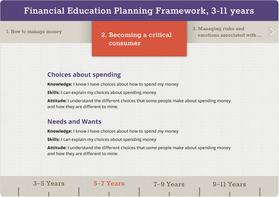
Initial visual concept for digital solution
A first concept is an initial ‘best guess’ and always makes a lot of assumptions. For pfeg this was no different and during the meeting these assumptions were scrutinised and ultimately validated or rejected, resulting in an updated set of needs:
- The digital frameworks must be closely related to the print version – visual design, colours and learning outcomes in similar containers so the two can easily be cross-referenced.
- The solution must be fully responsive from desktop right down to mobile devices.
These two additional needs changed the challenge significantly. How do you compress two information-packed A2 printed posters into a usable digital solution for mobiles, tablets and desktops that provides intuitive exploration and easy comparisons across age ranges?
The prototype
Starting with the smallest available space – mobile devices – we went back to the drawing board. We kept those elements of the first concept that were identified as working – such as using horizontal space as a way to navigate and easily compare different age ranges – and brainstormed how to shrink the experience down to mobile dimensions. Meanwhile, we introduced greater visual consistency with the printed posters.
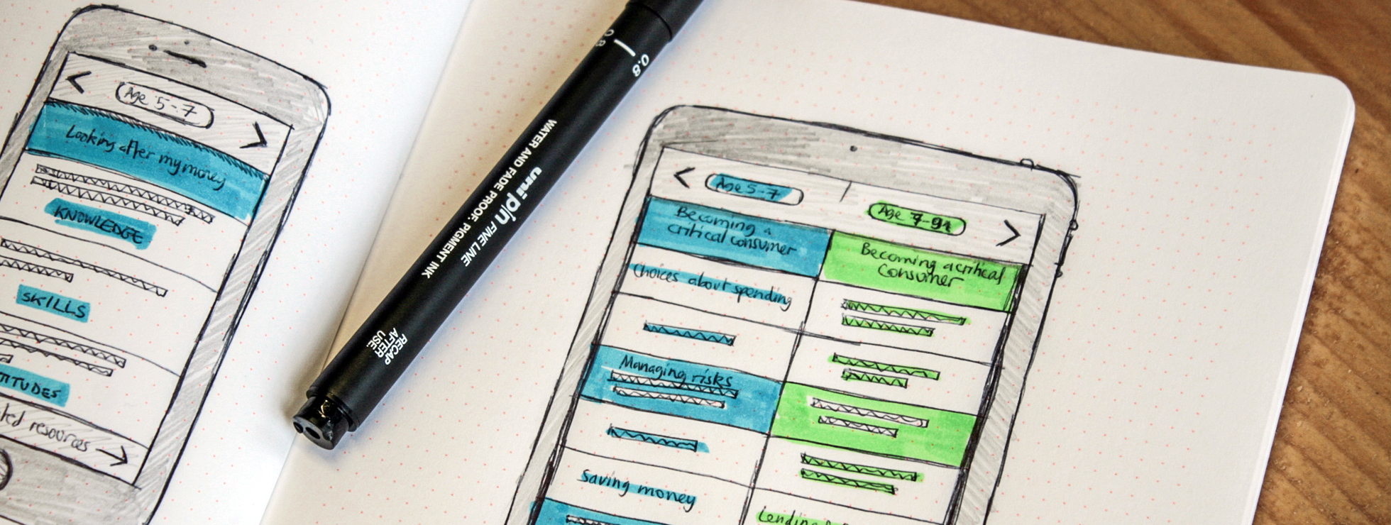
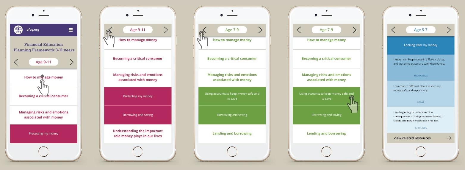
The result was a series of low-fidelity sketches and a conference call to discuss the approach.
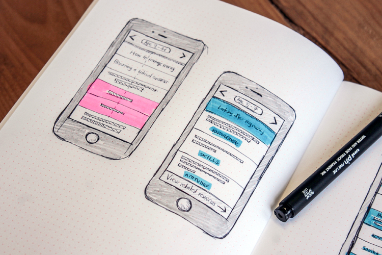
Low fidelity sketches showing the proposed solution for mobile devices
Feedback on the sketches was positive – it looked like a mobile pattern that met the identified needs, would scale up well and wouldn’t cost the earth to build. But lurking in the back of everyone’s mind was a concern that the sheer volume of information being presented could render the solution cluttered and cumbersome to interact with.
So our next step was to create a functional prototype that could be used on a mobile device. We used proto.io for this, as it allows you to create interactive mobile UI concepts, quickly. Watch the short video demo of the pfeg prototype in action.
Feedback on the prototype was hugely positive. It felt comfortable to interact with, the navigation across age ranges was intuitive, and information flowed logically when drilling down into different sections.
Some minor iterations followed, and by this point we knew that the design would work on our lowest common denominator – the mobile device. From there we added an additional column to the prototype to proof the portrait tablet experience, before finalising the designs with storyboards that showed how the solution scaled up to larger screen sizes.
The solution design
Essentially, our chosen responsive pattern scaled the columns until the minimum width requirement was met to add another column – at which point a new column was added to the right. This provided a consistent experience on all devices and a fluid, natural transition from small screens to large.
Mobiles
A single column – we polished and finalised the prototype’s visual design, and the user swipes left or right to view the next column.
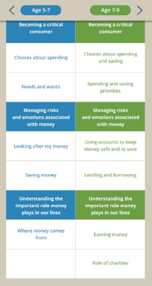
Portrait tablets
The second column appears naturally at a specified width, providing the user with at-a-glance side-to-side comparisons.
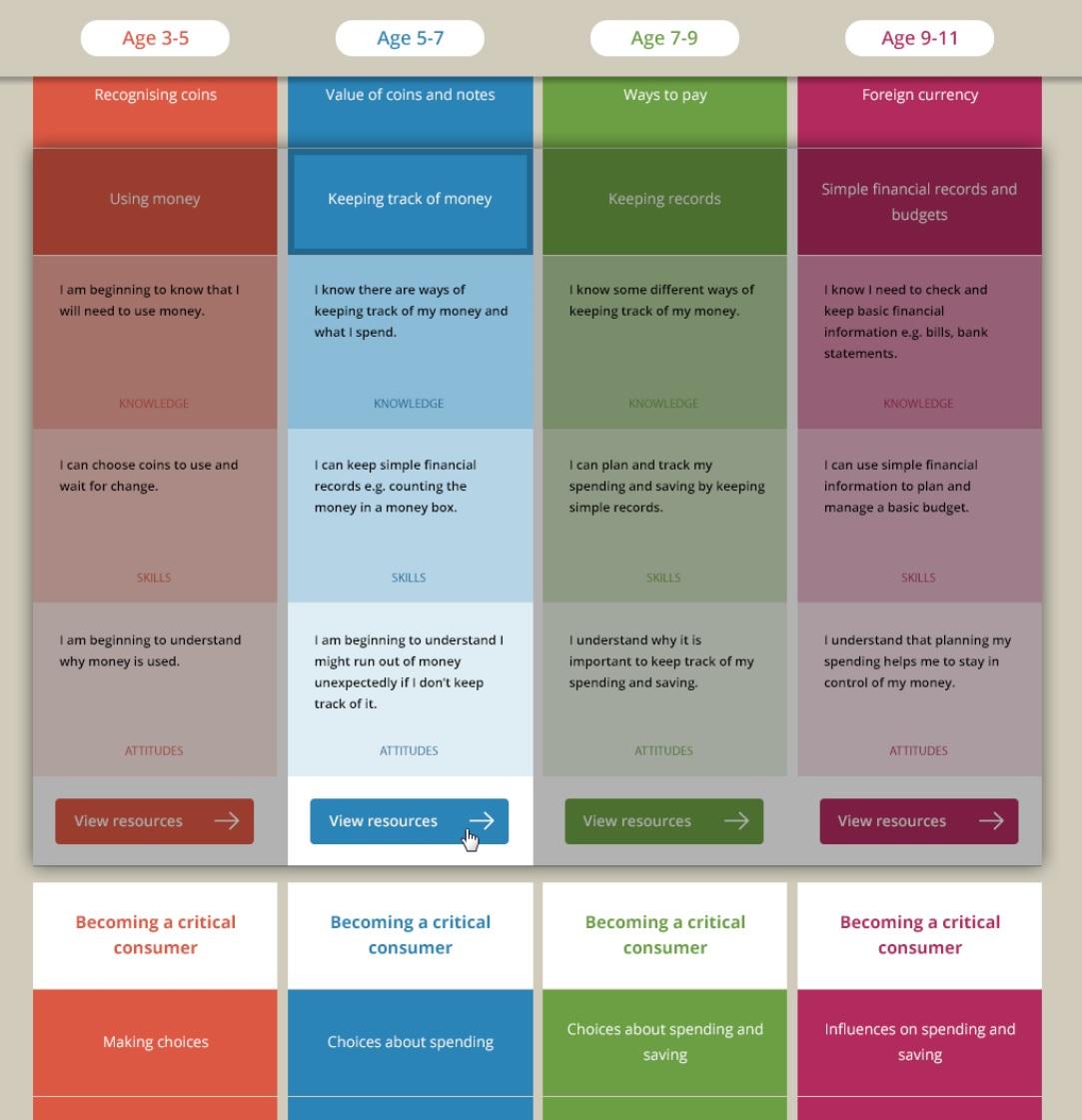
Laptops and desktops
At larger screen sizes, where much of the frameworks would be visible at the same time, a subtle dimming and highlight effect was added to aid navigation, and focus attention on the learning outcome currently in focus.
The next challenge
The final product successfully translated pfeg’s two information-rich A2 printed posters into an accessible and engaging mobile experience, which scaled up seamlessly to tablets and desktops.
Are you looking to build a new digital experience or optimise what you already have for mobile? By commissioning a prototype instead of wireframes, storyboards and specifications, you can mitigate risk and get more value.
It’s better to invest time in prototyping an experience, rather than challenging stakeholders to imagine it through a series of static diagrams, wireframes, documents and designs.
Ed Wilkinson
Digital Services Director, IE Digital