
Mind
Image
Client
Mind
Services
User research
User Experience
Prototyping
Industry
Charity
Health charities
Health
Mental health
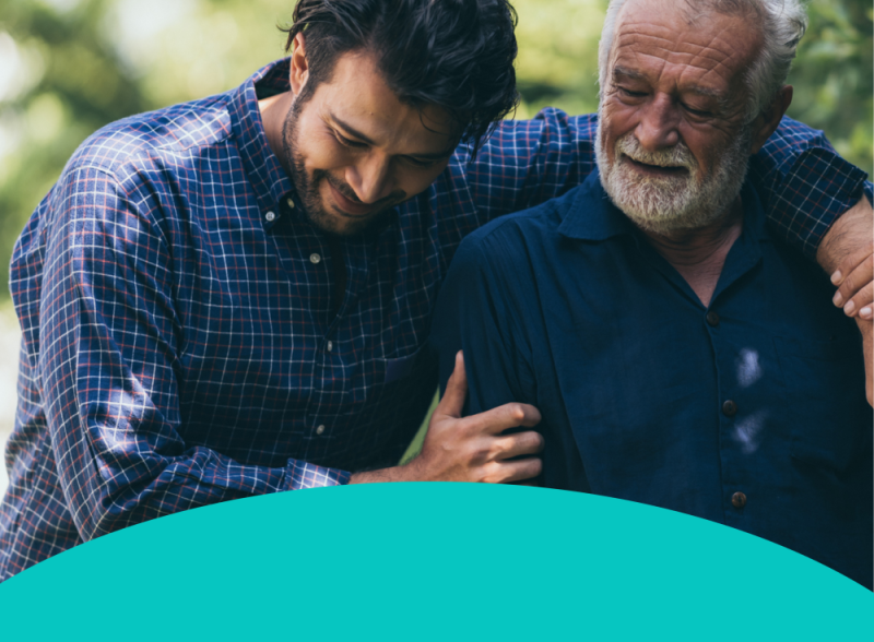
Mind’s new strategy was focused on three key audiences: young people, people from racialised communities, and people experiencing financial hardship. Research showed these people were most at risk of mental health problems but weren’t typically being reached by Mind.
The charity needed to ensure their website met the needs of these audiences. Mind commissioned IE Digital to conduct detailed user experience (UX) research. This research informed our recommendations to improve the user experience. This was followed by an experimentation phase: looking at the mobile experience, exploring new user mindsets, and prototyping changes to the user interface.
For over 60 years, Mind has worked to improve the lives of people with mental health problems. They won't give up until everyone experiencing a mental health problem gets support and respect.
Image

Image

Listen
User research and UX evaluation
As part of Mind’s 5-year strategy, they had explored which audiences they were reaching the least. They defined 3 strategic audience groups at particular risk of mental health problems. IE Digital went on a fascinating journey with Mind, conducting qualitative and quantitative research.
User research with help-seekers
Mind needed to hear from help-seekers, to find out their views on the charity and its website. The main theme was to improve the accessibility and approachability of the website for our 3 audience groups.
- Children and young people: There is a fast-growing mental health crisis, accelerated by the pandemic.
- People from racialised and minoritised communities: More likely to experience a mental health problem but less likely to receive the help they need.
- People experiencing financial hardship: People with mental health problems are more likely to experience financial hardship. And people experiencing financial hardship are more likely to have mental health problems.
On-site user feedback
We invited visitors to the Mind site to take part in a short survey. 410 English and Welsh users responded.
- 40% reported some degree of financial hardship, while 10% preferred not to say
- 13% identified as an ethnicity other than white.
- 18% were under 25 years old
- Some intersected across these groups
They gave their reasons for visiting the site:
- 38% information and support for myself
- 25% help with how I am feeling right now
- 16% find support from Mind where I live
- 15% help someone else
- 6% help Mind with their work
Qualitative research interviews
Next, we recruited research participants from each of the 3 groups. We also spoke to gatekeepers from organisations that support people experiencing financial hardship. Our researcher conducted in-depth interviews with each person. We asked about:
- how they support their mental wellbeing and where they would turn in a crisis.
- any barriers they face to accessing mental health support.
- their perception of Mind and how the website makes them feel.
- what mental health organisations could do better.
- what is stopping them from connecting with Mind, and how to reach them with mental health support.
Supporter research
While most visitors to Mind's website are looking for mental health support, around 20% want to get involved or give something back. There was a suspicion that Mind may be missing out on some of these potential volunteers and donors.
IE Digital interviewed people about their experiences with charities and their awareness of Mind. Participants then explored the supporter journey on their smartphones, with some specific tasks. Some participants found the experience confusing and struggled to complete the task. This validated our hunch and showed where we could improve the supporter journey.
We also evaluated the website for user experience and online performance. We looked at Mind along with 3 comparable websites, leading to more UX recommendations.
Image

Image

Our consultants always made it feel like a shared endeavour. IE Digital were flexible, collaborative, and helped us make the best use of our budget. Their recommendations were always practical, actionable and user-centred. We had a really positive relationship with IE as our user research partner and I’d highly recommend them.
Ben Williams, Digital Analyst, Mind
Image

Image

Advise
Insights and recommendations
IE Digital’s user research provided a wealth of qualitative and quantitative data. This led to some valuable insights on Mind’s 3 strategic audiences and their supporters. This informed our recommendations for the Mind website.
We didn’t identify any huge gaps or uncover any straightforward recommendations such as “do X to better reach audience Y”. Instead, our findings were much more nuanced. What came through loud and clear was not to label these groups or treat them as separate on the website. Instead, we needed to address race, age, and hardship-based differences within the continuum of mental health that applies to us all.
This led to some broad-ranging recommendations – threads to be woven throughout the website and other touchpoints. It was all about reaching users at the ‘outer edges’ of Mind’s audience in a subtle way.
To help Mind engage better with their strategic audiences, we recommended:
- Update existing user personas, rather than create 3 new ones.
- Review core messages and calls to action – making small, incremental changes to strike the right tone for all audiences.
- Reduce or remove targeted content – content targeted at specific audiences was polarising, either seen as pandering or irrelevant.
- Adopt a more conversational tone of voice – young people and those experiencing financial hardship preferred more relaxed language. Make it feel more like a chat with an understanding friend.
- Create a more interactive, personal user journey – improve the user experience and curate content by theme. Add an intelligent search tool, for a less linear experience.
- Review the mobile user experience – younger users and those experiencing financial hardship often relied on lower-end mobile devices. The website UX was a challenge for these groups.
- Bring the conversation into the community – explore ways to reach audiences offline, through local community groups, places of worship, and schools.
- Conduct further research – more information needed to understand users experiencing extreme financial hardship.
Each of these recommendations came with a set of proposed actions or testing for the next phase of the project.
Image

Deliver
Experimentation and testing phase
After the research phase, we began a period of experimentation and testing. Based on our recommendations, Mind chose 3 areas of deeper exploration from a range of options:
New user mindsets
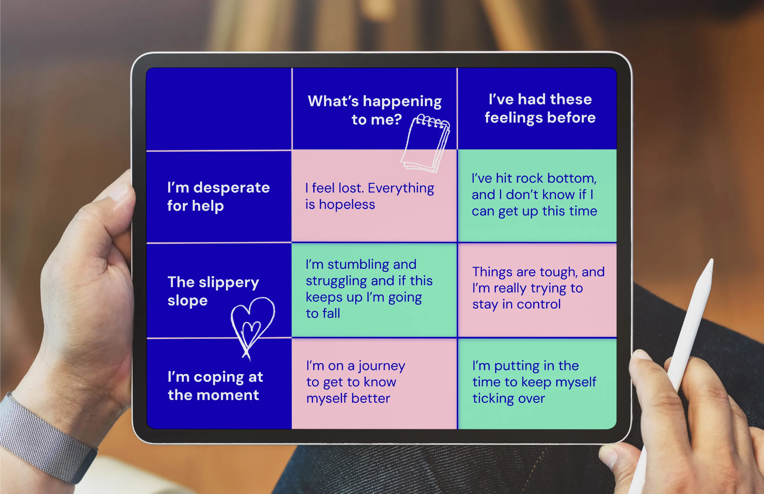
We converted Mind’s existing user personas into new mindsets, to show how people feel and what they need.
We split Mind’s service-seeking audience into 2 groups, based on their experience:
Those experiencing mental health concerns for the first time. They needed more reassurance and active guidance.
People who recognised their feelings from previous experiences. They were more able to self-serve to find the support they needed.
These were both mapped against 3 key stages of the mental health continuum:
- Coping at the moment
- On the slippery slope
- Desperate for help
This created a matrix of 6 distinct user mindsets, which we fleshed out based on our research. The messaging didn’t need a major overhaul, but each new mindset is peppered with notes to the digital team. These remind content creators of the situations, backgrounds, and barriers that might apply. This includes nuances for social, cultural or religious factors, to include our key audiences.
We validated the mindset matrix with users through a self-identification testing process. People from our strategic groups needed to recognise themselves, not feel alienated or excluded.
Improve the mobile experience on a range of devices
Around 75% of visitors to Mind’s website were using mobile devices. But younger people and people experiencing extreme hardship often use lower-end phones. They were least likely to have a good experience on the website. This was stopping Mind from reaching its strategic audiences.
We conducted various accessibility tests across lower-end mobile devices. This revealed issues from layout and functional problems to slow loading times. There were considerable differences between the experience on desktops and on mobiles. This led to further recommendations for Mind to improve usability, accessibility, and engagement. This was particularly important to include children and people experiencing financial hardship.
Prototyping a better browsing experience
We built an interactive prototype in Figma to reimagine Mind’s ‘Information and Support’ section. They had a huge amount of content buried in layers of navigation. The website sometimes felt like an online book, with a dry, A-Z index of content. Our vision was to bring this rich content to the surface and make it more interactive. This work also tied in with an internal content audit that was underway at Mind.
This proof of concept turned a hierarchical browsing experience on its head. It was easier to search, browse, and move between content. We wanted users to feel they are taking a more personal journey – to manage their wellbeing, research treatment options, and more.
We used TreeJack to test ways to tag and curate content by theme and content type. We then reimagined the section with a more engaging and effective user interface that:
- curates content by theme.
- allows people to search with an intelligent autocomplete function.
- provides opportunities to cross-promote relevant content.
- helps the user find content in a variety of ways, not by a single route.
For the user interface, we took cues from browsing Netflix or shopping online, with carousels to highlight popular topics. We also added a 'sticky' content filter on the left hand side.
This made the user experience less linear. It made it easier for users to discover content that’s relevant and meaningful for them.
Clear content and conversational page titles
We redesigned Mind's more detailed content pages. This made the pages clearer, more accessible, and more approachable. Every page features a prominent invitation to ‘Get help now’ for users in a crisis.
We added an in-page navigation section to show what’s on each page, at a glance. Quotes from service users became clickable, allowing readers to explore the story further.
The prototype also showed how to rephrase some of the page titles. These became more conversational, like speaking to a friend, not reading an encyclopedia.
Finally, we added some of Mind’s decorative illustrations to the more clinical information. This added some softer, warmer brand touches.
Image
Video file
Every achievement in this annual report began with one thing. Listening. Listening to local Mind staff who see the biggest issues in their communities. To volunteers and customers in our shops. To callers to our helplines. To our partners, supporters and funders. To everyone who’s ready to fight for mental health.
…the only way to understand and tackle the biggest issues is to listen to the people most affected. By listening to real experiences, we create real impact.
…the only way to understand and tackle the biggest issues is to listen to the people most affected. By listening to real experiences, we create real impact.
Mind Trustees’ Annual Report 2022/23
Image

Image

Support
The beginning, not the end
It was important to Mind that this project didn’t end with a report sitting in a drawer. They needed to see practical recommendations they could follow to create real change.
IE Digital did just that. Mind's digital development team now has a mobile optimisation checklist, based on IE’s recommendations. They are improving the content for the 'Get involved' supporter journeys. And the prototype 'Information and support' section is informing the in-house development work. The research provided benchmarks for Mind to track their progress in engaging these audiences.
The updated user mindsets will now inform everything on the Mind site. This will better reflect the diversity of the audience, and the barriers they may face. And there's still more recommendations to explore from our findings report.
Most importantly, Mind is now in a much better position to reach their strategic audiences, and give them the mental health support they need.