Coram
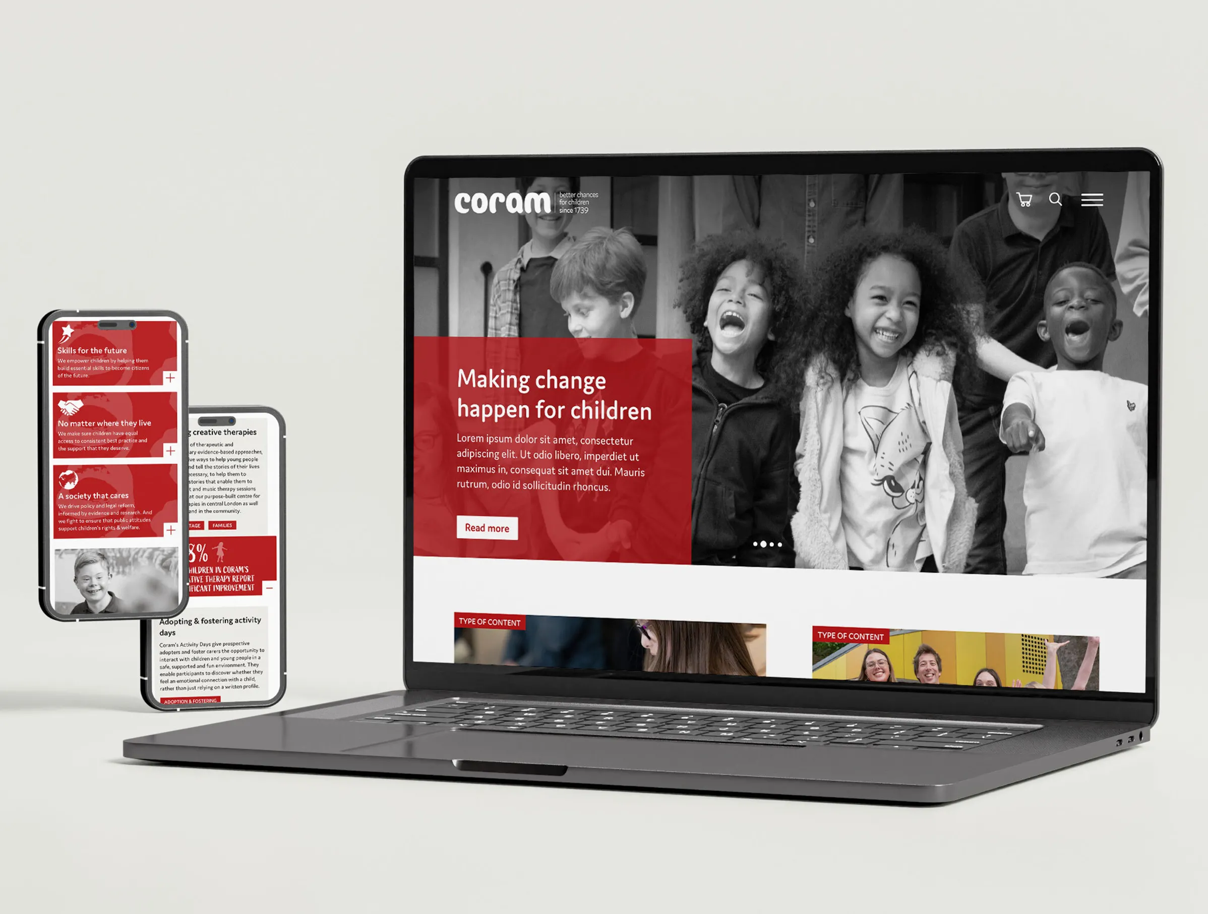
IE Digital designed and built Coram a rich, modern new WordPress website to support the delivery of the charity’s new strategy. We streamlined their existing presence and designed the user experience around key user journeys.
Established as the Foundling Hospital in 1739, Coram is the UK’s oldest children’s charity. Now a vibrant group of specialist charities, Coram champions children’s rights and wellbeing, and makes lives better through legal support, advocacy, adoption and a range of programmes.
The old website was no longer fit for purpose. The new one has been built to grow with the charity as it continues to evolve. It positions the charity effectively, tells their story clearly, and helps users to navigate their Group structure intuitively.
Visit IE Digital's new website for Coram Group | Visit the Coram Story website

IE Digital had worked with Coram on several previous projects, so they already knew us as a trusted agency partner who understood their brand well.
With their new 10-year strategy in place, and a decade since the original website was built, Coram asked us to design a new Group website that would grow with them as they evolved.
As Coram is a complex organisation with multiple departments and stakeholder groups, it was important that everyone’s voice was heard. The new site had to meet the needs of the entire Coram Group, so gaining buy-in from key stakeholders as early as possible was essential.
Defining the key website requirements
We ran 4 in-depth workshops with key internal stakeholder groups. These helped us understand how they felt about the charity’s existing online presence, what they wanted from the new website, and what the challenges might be.
There was a lot of synergy across the stakeholder groups. Key requirements included creating a website that:
- was based on a rich understanding of Coram’s audiences, presenting their services in an accurate, accessible, and engaging way
- looked bright, impactful, modern and fresh, and reflected Coram’s new brand messaging
- was visually arresting, including making better use of video and photography
- had a simplified content structure and intuitive navigation – improving the user experience for all primary audiences and making it easy to find and engage with content
- made it clear that Coram is a group of charities, with clear links to the different entities
- increased the effectiveness of various income streams, including fundraising, conference bookings, and training opportunities
- delivers an intuitive editorial experience, allowing the Coram team to easily and effectively manage content in house
Outlining Coram’s key audiences
The workshops also helped IE’s digital consultants understand the key audiences the new website needed to reach. These included 3 primary audiences:
- Funders and supporters
- Service users
- Commercial / professional services – people interested in conferences and training, the Coram shop, or other programmes
Secondary audiences included:
- Corporate partners
- Researchers and academics
- Journalists and the media
- Policymakers and local authorities
- Teachers and social workers
- Job seekers and Volunteers
- Funders and donors
Conducting secondary research
Along with stakeholder engagement, IE’s digital consultants conducted a thorough UX review of Coram’s website and analysed its traffic profile. We also carried out competitor research to see how the website was performing compared to competitor sites.

Throughout the project, IE Digital acted as the voice of Coram’s users, ensuring their needs were front and centre of the new website’s design and build.
Mapping the user journey
IE’s digital consultants led interactive workshops to map out key user needs and journeys through the site. We then designed the user experience for each audience and objective.
Developing a new website using a needs-based (rather than a demographic, role or job-based) approach makes for a more intuitive structure and smoother user journeys. In Coram’s case, it doesn’t matter who the user is or their job. What unites them is their need – the reason they came to the site – and what Coram has to offer them.
We based the user experience around various user needs:
- Advice and information seekers wanting to understand Coram, quick information, or to sign up for a newsletter
- Support givers looking to donate, fundraise, or volunteer
- Policymakers looking for research data, thought leadership or Coram’s stance on a particular topic
- Research and consultancy commissioners
- Job seekers interested in applying to work for Coram
- Direct purchasers booking an event, paying for membership, or buying items from the shop
Information architecture and content approach
We proposed designing the information architecture for the site using a library metaphor – using books, chapters and pages to define the content structure. We advised building the main navigation around four ‘books’: About us, What we do, Work with us, and Support us. This was to ensure that we structured content logically and intuitively for users, while clearly signposting to lower levels.
We also advised the following approach when it came to content:
1. Don’t tell your users, show them – Discovering the breadth and depth of Coram's work should be dynamic, engaging and compelling – not static, dry and time consuming. We suggested using interactive elements to help users discover and understand the Group’s breadth of work. We also advised cutting the amount of copy on most pages, reworking content into more easily digestible chunks.
2. Shout about your impact – Coram was missing a big opportunity to make more of the impact they make. The new site needed to bring this to the surface, and position it alongside the work that the charity does, in a clear and simple way for their users.
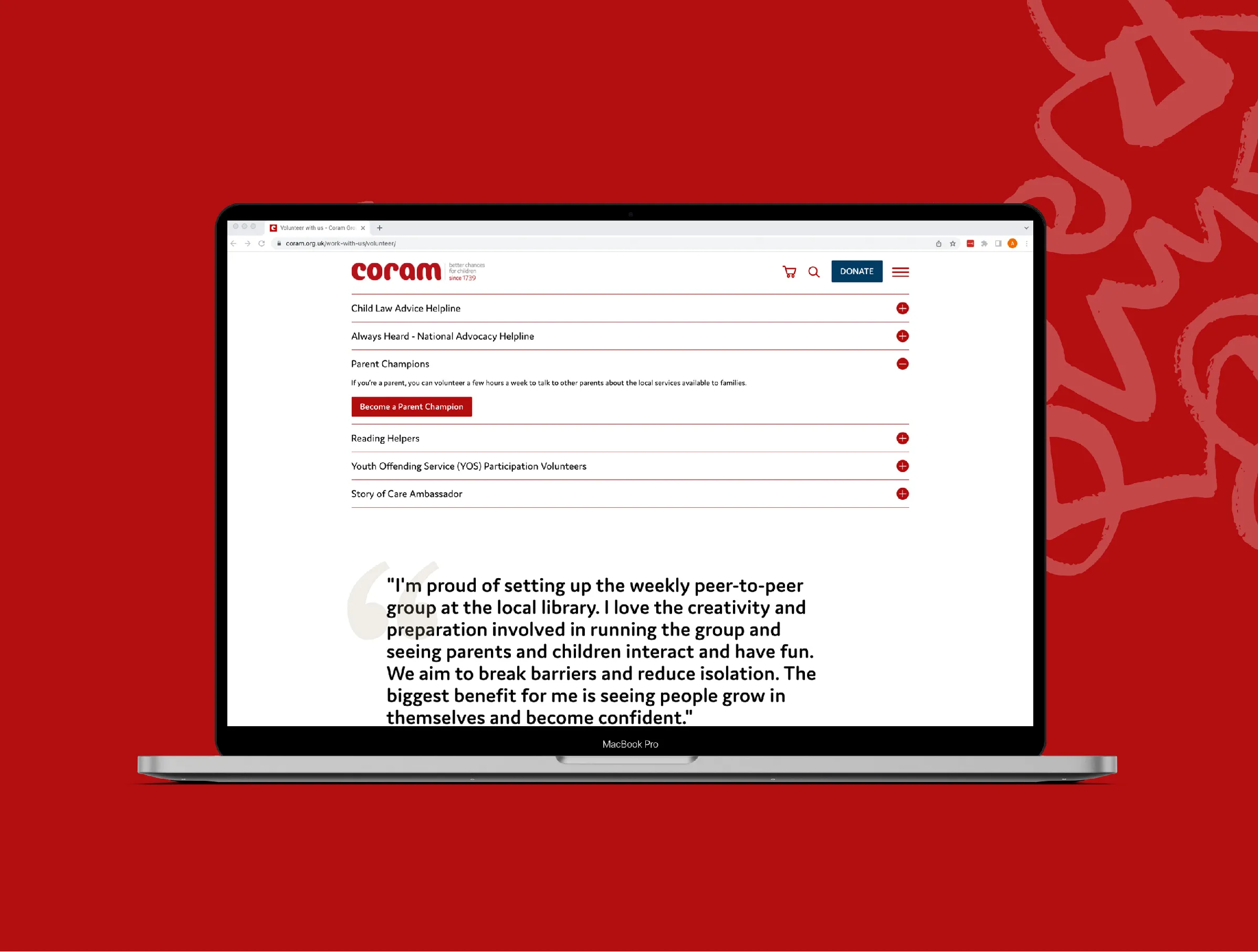
3. Simplify your calls to action and engagement – Whether it was donating, fundraising, volunteering, or supporting in some other way, Coram’s previous site made engaging with the charity really difficult. We advised simplifying and streamlining processes to be more user centric, and to encourage users to remain engaged.
4. Keep things simple – The old Coram site highlighted their complexity, overloading users with information straight away. We advised that the new site should group content more logically, and introduce complexity (such as different service offerings and brand names) more slowly. This would allow users to slowly uncover more detail and engage with relevant content as they read and understood it.
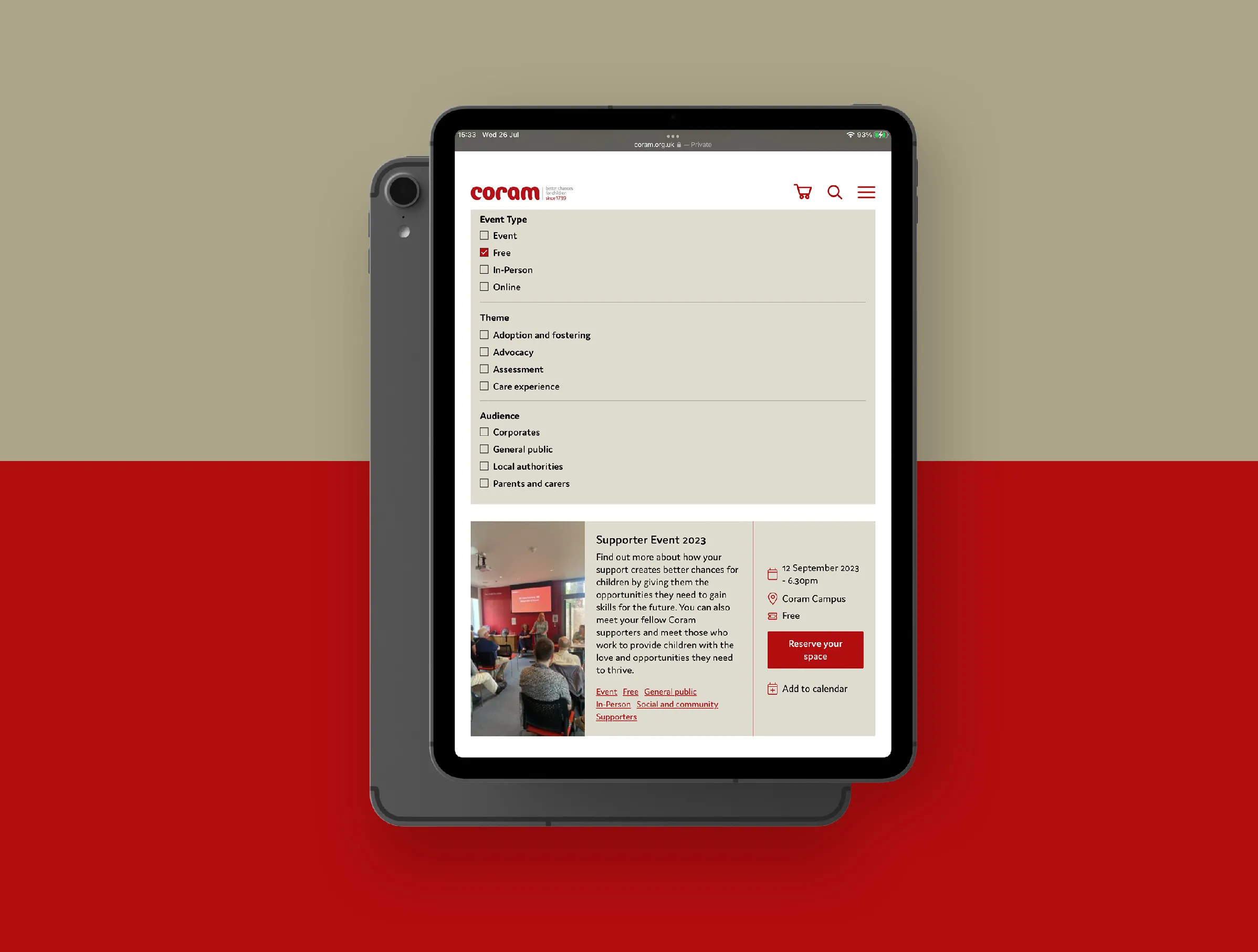
5. Better searching and easier discovery – Coram wanted people to spend more time on their site. However, the previous site made it hard for users to discover content except in menu structure. We suggested having more dynamic content listings, with more methods of filtering and faceted navigation (such as topic, type, theme, and project). We also suggested better crosslinking of genuinely relevant content to reduce the number of dead-end pages.
Planning for success
We compiled all of this into a ‘project charter’ document. This captured the website’s audiences and the key decisions made, and defined the overarching scope and approach to the project. This acted as an evolving record of the project, with project milestones, deliverables and our agreed success criteria.
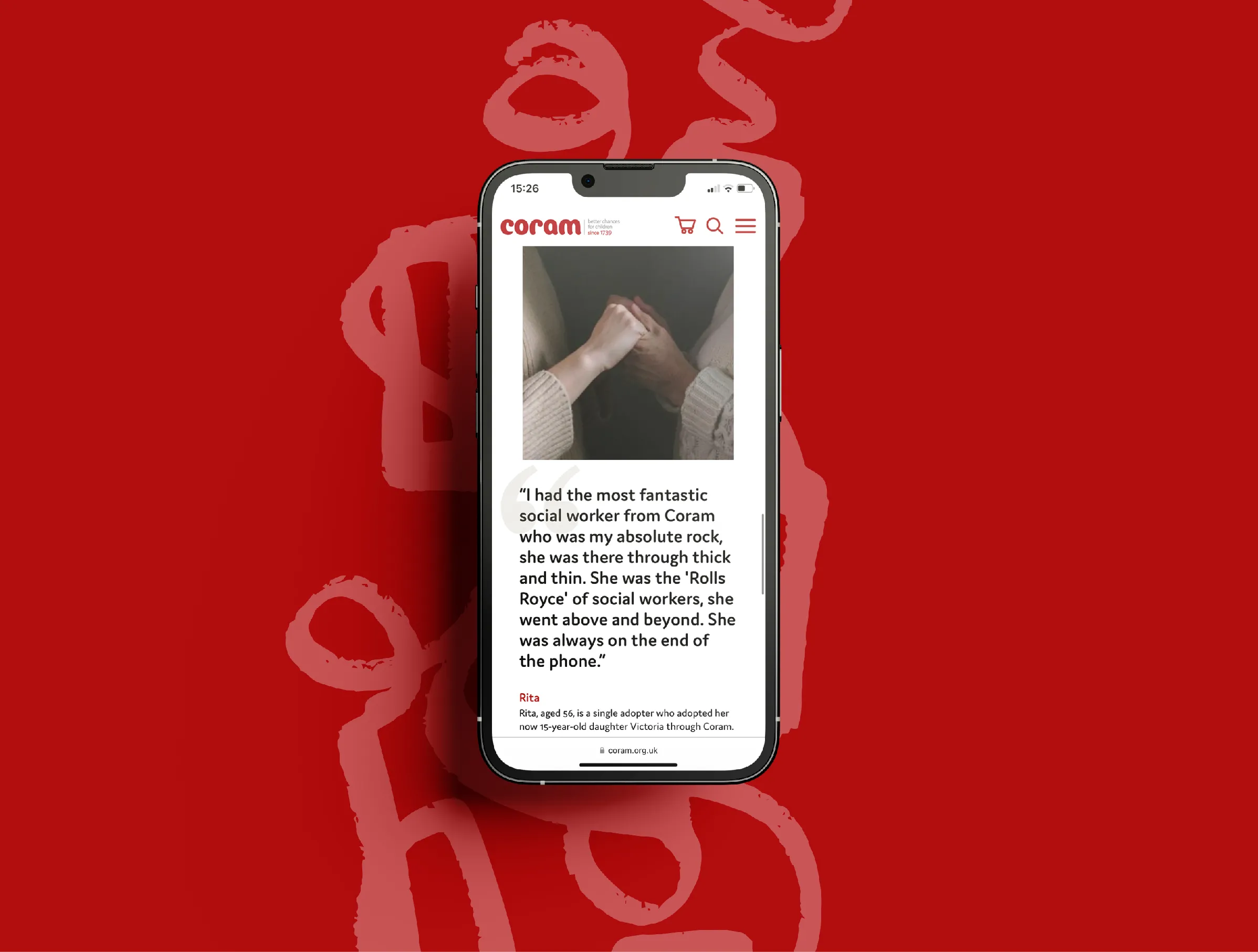

As part of the redesign process, Coram wanted a modern, flexible, intuitive and user-friendly CMS that met their technical needs. Taking on board their requirements, we recommended they move their website from Drupal to WordPress.
IE Digital’s design team defined the new WordPress website structure and content hierarchy to show how Coram’s new site would be organised.
Next, the team created low-fidelity mock-ups – a series of wireframes that mapped out the main features and navigation of Coram’s new website.
Our designers then added the visual flourishes to bring Coram’s brand to life, with a set of storyboards to show exactly how the finished website would look. Coram has a unique brand and style, which allowed us to introduce a range of different treatments to elements throughout the site.
Content creation and training
Having built the main structure for the website, our WordPress developers created a ‘content toolkit’ – a set of fully editable page templates, designed to ensure consistency and a seamless user experience throughout.
We trained the Coram team, remotely via video conferencing, to create new pages from a variety of predefined components and styles. The team were then able to populate the CMS with new content based on the agreed information architecture.
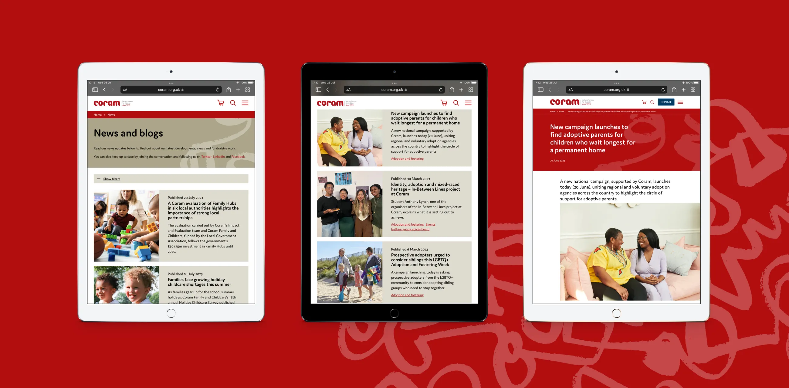
It was important that the new website measurably improved on inbound traffic levels. Organic search engine optimisation (SEO) was key to achieving this. We needed a consistent approach to incorporating strategically important keywords and phrases within the site structure and page content.
IE Digital created a content guidelines document for the Coram team. This included the recommended keywords and phrases to target, along with advice and best practice examples to help drive high-quality inbound traffic to the new Coram Group website.
Ongoing maintenance and support
IE Digital hosts the Coram Group website through Pantheon and provides ongoing support, maintenance and website hosting. Our helpdesk supports Coram with any issues that arise through our dedicated ticketing system.
We also support the Coram Story website, which we designed and built in an earlier project. Coram Story tells the history and heritage of the Coram Group, dating back to 1739 when Thomas Coram established The Foundling Hospital. At the centre of that site is an interactive timeline of Coram's history.
