Resuscitation Council UK
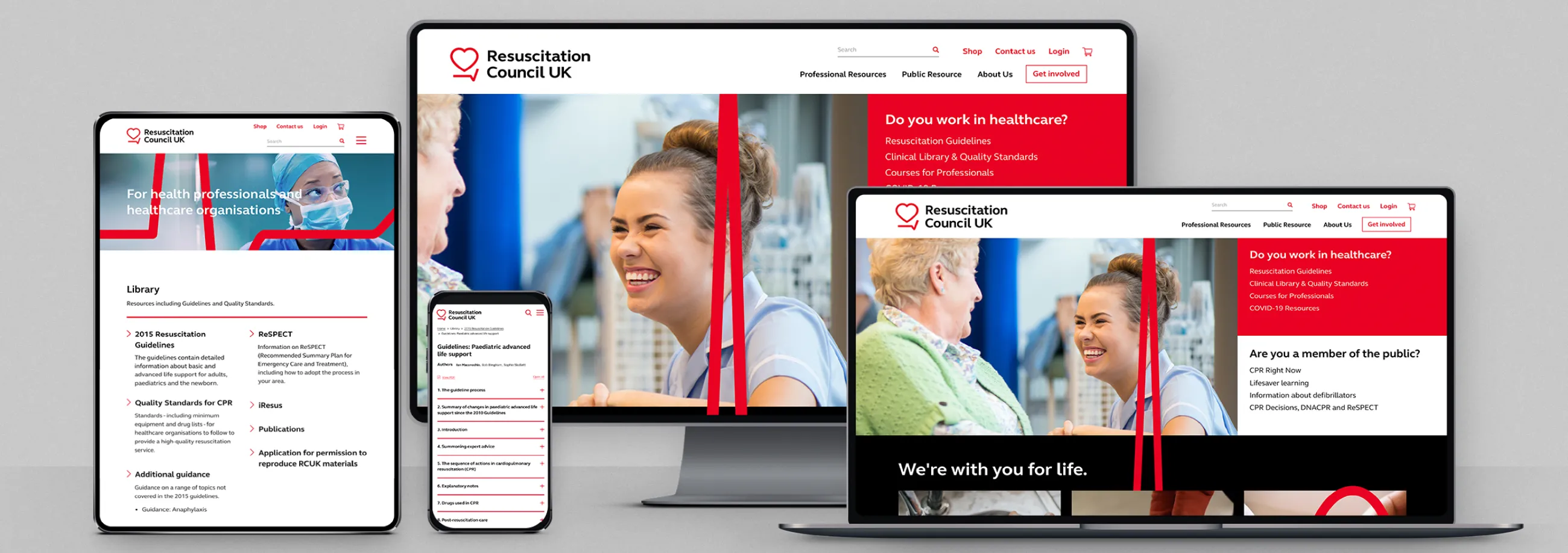
To support Resuscitation Council UK’s ambitions to transform into a more public-facing brand, IE Digital designed and built a user-friendly new Drupal 8 website for the charity, with a vibrant new visual identity.
Resuscitation Council UK is working towards a day when everyone in society has the skills they need to save a life. The healthcare charity achieves this goal by delivering training (its primary source of funding), developing guidelines, influencing policy, and supporting cutting-edge scientific research.
The original website was already a vital clinical resource for healthcare professionals, but was failing to engage a wider audience. IE created a contemporary content-managed website. We drew on extensive user research and carried out a full content audit, to provide an intuitive user experience for healthcare professionals and the public alike.


As part of a wider stakeholder research brief around the charity’s rebrand, IE Digital explored users’ views on the existing Resuscitation Council UK website.
The research confirmed that the website was ripe for an overhaul. Although the site was full of rich content that scored highly with users, they were struggling to find what they were looking for. The site was clunky, text-heavy, and difficult to search and navigate.
If Resuscitation Council UK was to engage a much wider audience – including the general public – it was going to need a more intuitive website, based around the needs of the user.


Visually, it looks great. The tone is welcoming and accessible while maintaining the understated authority and clinical credibility which remain key to our reputation. The new website... will play a transformational role for us as an organisation, increasing our ability to engage and influence expert and public audiences alike.


IE facilitated workshops to map out key user needs and journeys through the site, which was used to design the user experience for each audience and objective.
Healthcare professionals and organisations seeking clinical content to maintain best practice in their field, or guidance on detailed issues or processes such as "anaphylaxis" or ReSPECT (Recommended Summary Plan for Emergency Care and Treatment). They may also be looking for professional training courses in resuscitation skills or considering membership options.
- The public might be interested in learning about resuscitation for the first time or seeking support as a survivor of cardiac arrest.
- Other organisations from outside the healthcare sector – such as community organisations, schools or sports clubs – may access the site, looking to educate their teams.
- Additional audiences include course instructors and other influencers, including government and the media.
IE Digital’s consultants worked closely with the Resuscitation Council UK team to define a dozen key user journeys for the website.
Information architecture and content audit
It was vital at this stage to simplify and organise the vast array of content on the site. Every piece of website content was audited, tagged and categorised to fit into an improved information architecture based around ‘Professional’ and ‘Public’ resources.
We also added a clear call to action to “Get involved” in the main navigation, signposting memberships, donations/legacies, campaigns and social media links.

IE Digital’s consultants created wireframes for the website, based around the defined user journeys and information architecture.
These were then handed over to our digital designers, who took a mobile-first approach to designing the new Resuscitation Council UK website.
We chose Drupal 8 – the Open Source content management system – to build the site. Drupal integrates well with other systems and supports Resuscitation Council UK’s aim for a more automated content publishing process.
The resulting site is secure and accessible, with a wealth of information to be discovered through an intuitive search functionality, a series of carefully curated FAQs, and easy access to PDFs and other supporting materials. We incorporated an online shop for key publications and a donation engine to support further fundraising objectives.
The modern site design reflects the vibrant new Resuscitation Council UK brand and strong colour palette, designed by IE Brand. It incorporates subtle front-end flourishes such as animated ECG patterns, which are a key element of the brand’s visual identity. Most importantly, the site is easy to navigate and guides users on their journey with clearly signposted, expert content.
Read more about our project to rebrand Resuscitation Council UK.
Testing and go-live
Because of the high volumes of user traffic on the website, and the critical life-saving nature of the content, we took extra special care to limit any user disruption as we switched to the new website.
IE Digital moved the site into our live Pantheon hosting environment a month or so before the go-live date, to allow plenty of time to test any complex functionality and integrations with third party systems. That meant that we only needed to do minimum configuration and DNS updates on the go-live date.


For the launch of the new site, the Professional area was prioritised for Resuscitation Council UK’s core audience of health care professionals.
As the charity gradually builds its profile among the public, the content in the Public Resources area of the site will be improved and expanded further. A user survey on the new site will also inform future developments to the site.
The Resuscitation Council UK rebrand won Bronze for 'Best Visual Identity from Healthcare and Pharmaceuticals' at the Transform Awards Europe 2021.


